
Twenty years ago, when Managing Partner Carlo Cuesta and graphic designer Mary Brozic came together to develop the Creation in Common logo, we didn’t know exactly where our company would end up. But we knew what we wanted to do: Help people lead and create together. Although our branding has slightly shifted slightly since we developed our first brochure above, our logo is the same. It still speaks to who we are and what we strive for.
Mary: I met Carlo and Dana when he became the Executive Director of the Playwrights’ Center. My husband was a playwright and one of the founding members, so we met the first weekend they arrived. Dana and I instantly synced. She hired me to help her with graphics for her new job at Pillsbury. When Carlo left the Playwrights’ Center and they start started Creation In Common, they already had the name and an idea of how they wanted it to look.
Carlo: Our mission is to strengthen communities through shared creativity, so the name seemed very appropriate. We felt it captured the longer mission in just three words. I knew I wanted “creation” and “common” to be lowercase. It just felt right to emphasize the connection between the two words — one is no more important than the other. It was Mary’s genius to use just words in our logo rather than an icon or graphic. She took the combination of the words and the swirl of the mission statement underneath to create a graphic mark.
Mary: I remember we talked about positioning the organization as professional, but also artistic. And so that’s why I put the tagline on the swoop. The name, “Creation in Common” is in bold colors, but it’s very straightforward, rendered in serif font. It lends itself to a certain professionalism. But then there’s a playful side that shows clients — we’re artistic, we’re cool. We can do both. We use both sides of our brain.
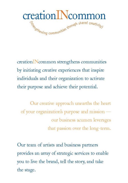
Carlo: Mary chose the colors and we loved them. I just loved the deep royal blue with the spark of deep orange. Also, it’s the same colors as the New York Mets, my favorite baseball team growing up. (But don’t tell our co-founder Padraic — he’s a huge New York Yankees fan!)
Mary: I know people have tried to get them to change their logo over the years. They considered doing a refresh last year. And I’d be cool with that. On the other hand, I do think there’s something to be said about maintaining a brand. Through all the ups and downs of many different websites and technologies, they’ve stay true to their brand.
Carlo: Our logo still speaks to who we are and what we do. It still illustrates what we care about most and our deeper sense of purpose: Helping people lead and create together. That is “creationINcommon.” And that’s what results from strengthening communities through shared creativity.
Mary: Although the logo remains the same, I think that Dana and Carlo have figured out how important it is to flex. They’ve been in business so long, they needed to flex during times when the world changed. They’ve been able to change and adapt and figure out another route or add something to the tool chest. They’ve never just stayed in place. They live their brand and model the behavior they teach every day.